Fraktur (Typeface and Handwriting)
The German word Fraktur can refer to three different features: to a family of typefaces, to a form of handwriting script, and to an art form (illuminated manuscripts). The art form of Fraktur is described in a separate article in GAMEO.
Fraktur Typefaces
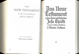
The word Fraktur is derived from the Latin fractus meaning "broken," since the lines and curves used to form the letters are broken or fractured. The Fraktur family of typefaces is part of a larger type family known in English as "Blackletter" and in German sometimes known popularly as "Gotisch" -- Gothic. This typeface is based on, and was designed to resemble, medieval Textura or Gothic cursive handwriting. The Gutenberg Bible, the first European book printed with movable type, was printed in an early form of Fraktur and almost all German language texts from then until the early 20th century were similarly printed in Fraktur.
A much different set of type faces, distinct from Fraktur, developed when Renaissance artists and type designers rediscovered lettering styles used in ancient Roman inscriptions. They then designed new typefaces based on these letters to produce typefaces identified as Latin types. Times Roman and Arial are examples of these typefaces. Technically these are "Antiqua" typefaces. New forms of handwriting, now known as Latin scripts, were also derived at this time.
As the Reformation movement swept Europe, Protestants began printing their works in Fraktur highlighting both the Germanic languages and their differences from Catholicism. Catholicism was associated with Latin and the Latinized countries to the south and west of Germany. From the start of printing Fraktur typefaces were used to some extent in all countries and languages north and east of Germany. The Anabaptists in the German and Dutch speaking states also printed the majority of their early works in Fraktur. The clash between Fraktur and Roman type was colored not only by these religious polarities but also by other great polarities in European culture: medievalism vs. modernity, Pietism vs. humanism, romanticism vs. enlightenment, nationalism vs. cosmopolitism and mysticism vs. rationalism. The Mennonite’s use of Fraktur type, and their reading of literature in Fraktur, influenced and positioned them on left side of these polarities much more than the right.
From the onset of printing, Fraktur books occasionally included Latin letters to designate foreign words or with special text much like italics are used today. In Thomas von Imbroich’s Confessio. Ein Schöne Bekanndtnuß … (Cologne, 1559) the first word on the title page, "Confessio," is in both the Latin language and Latin type but the rest of the work is in German and also in Fraktur. This mixing of types carried forward into the twentieth century Mennonite publications. For example in Hildebrand’s Zeittafel (Winnipeg, Manitoba. 1945) all the German text is set in Fraktur but text in Latin or English languages is set with Latin typefaces. The Christian Press, Limited. in Winnipeg, Manitoba, used Latin type for its English language name even in the German-language books it set in Fraktur.
In the 18th and 19th centuries higher learning became associated with Latin, and in Germany scientific works started to be printed in Latin typefaces. After the World War I, Fraktur typefaces began to go out of style as German society became more cosmopolitan. The Nazi regime in Germany had both a positive and negative impact on the use of Fraktur. Initially Nazis popularized Fraktur as being more Aryan than Latin typefaces, but in January 1941 for an unknown reason Martin Bormann declared Fraktur to be Judenlettern, that is Jewish letters, possibly because of the similarity of some Fraktur letters to the "Square" Hebrew script. Some writers speculated that the Nazis realized that Fraktur inhibited communication in occupied territories where the populations were familiar only with Latin types. This ended the general use of Fraktur type.
Since the end of the World War II, German printers have generally only used Latin typefaces. However, Fraktur in Germany is occasionally used for decorative type settings or headlines, and a number of newspapers continued to print their name in Fraktur in the early 21st century. The computer, with its numerous available type fonts, has caused a small revival of Fraktur.
Mennonites from Europe, in an effort to preserve both their Germanic languages and culture, continued the use of Fraktur in their printing in all the places where they lived as long as the German language was primary. The the vast majority of German language Mennonite works from Poland, Russia and Ukraine, United States, Canada and Latin America were printed with Fraktur type. In Canada the first Mennonite printing in the German language by the Peterson / Eby press in Berlin, Ontario in the 1830s and 1840s was in Fraktur. However, by the end of World War I Mennonites in Ontario had almost stopped producing books in the German language and their publications in English used Latin types. In western Canada the German language printing by Mennonites continued mostly in Fraktur. However, some individuals had their German language writings printed by local English job printers that lacked Fraktur types.
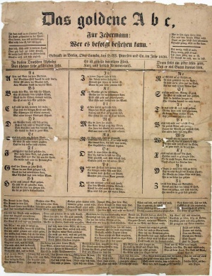
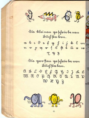
The introduction of typewriters in the late 19th century had a major impact on the use of Fraktur because typewriters with Fraktur fonts were almost unknown in North America. However, the influx of Mennonite immigrants in the 1920s and 1930s with their interest in advanced education revitalized German language Fraktur printing. Most Mennonite schools in western Canada taught the German language using textbooks printed with Fraktur type and also taught Fraktur handwriting script. Mennonites constantly reprinted old and well known German schoolbooks such as the traditional Fibel and A-B-C Bücher brought from Europe as well as select Fraktur text books for North America Mennonite Schools to teach the German language such as Herald Deutsch-English Fibel (Newton, Kansas: Herald Pub. Co., 1940) or August Engelberecht's Wartburg Fibel (Chicago, Illinois: Verlag des Wartburg Publishing House. no date).
The major change among Mennonites in the United States from Fraktur to Latin types occurred after World War I, but in Canada the change occurred a generation later, in the 1950s. For some printers the old Fraktur type wore out and it was replaced by Latin type because Fraktur types were scare. Then new printing equipment like linotype machines only set Latin type, and commercial job printing was almost always in Latin types. Newspapers like Der Bote began in the early 1950s to print some columns in Latin type and by 1955 had changed completely to Latin. Beginning in the 1950s this trend was compounded by the Canadian public education system which provided German language instruction as a foreign language with no reference to Fraktur type.
For most conservative Mennonite conferences Fraktur was familiar, and it remained their traditional book type. For most German-speaking Mennonites Fraktur type was inseparable from the German language. The language debates in the congregations over German versus English as the language of worship never involved a discussion of Fraktur verses Latin types. German speaking Mennonites in Latin America, Old Order Amish and Hutterian Brethren continue to print the majority of their works in Fraktur. Many of these works are reprints of earlier editions. To many readers in these denominations the idea of reading the German Bible in any type other than Fraktur is mentally awkward. Thus several of these groups have reprinted old editions of the Bible in Fraktur for their own use because printers in Germany no longer offer new editions in Fraktur. In Mennonite groups that wish to be separated from the world Fraktur is an important tradition and used as a barrier to outsiders and to outside ideas.
Fraktur Handwriting Script
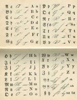
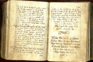
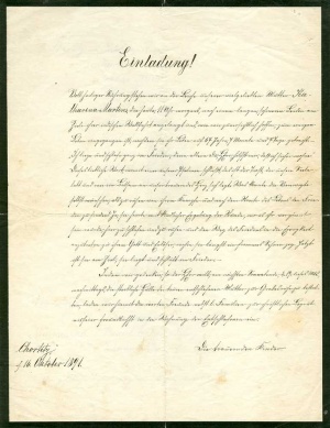
The Fraktur form of handwriting, technically known as "Kurrent" or "Kurrentschrift," and sometimes referred to as the Alte Deutsche Schriftt (Old German Script), was derived from medieval scribal cursive scripts that used broad lines with very thin connecting strokes. This type of handwriting was clear, easy to read and readily written with a quill pen. Like the Fraktur typeface, the modern handwriting developed into a nationalistic Germanic form of script when Latin forms of handwriting were encouraged in Catholic countries. Mennonites with a strong sense of literacy taught Fraktur as the common community script. In time good penmanship in Fraktur, called Frakturmalen, became a prized accomplishment with clear and decorative handwriting used in general writing and in documents, letter books and as special gift writings like genealogical charts, or Christmas greetings. In its most decorative form it became a recognized form of folk art.
Over the centuries Mennonite styles of handwriting have changed. In the 19th century the script became more pointed and angular, that is more straight up and down, and it lost some of the curved letter forms found in 18th century script. These changes however have been minor. A major reform of Fraktur handwriting occurred in 1915 when first the Prussian schools, and then the German national schools, introduced Sütterlinschrift. This was an upright, somewhat rounded style of Fraktur script designed by the graphic designer Ludwig Sütterlin (1865-1917). However, this stylistic change had little impact on North American or Russian Mennonite handwriting since few were schooled in Germany in the 20th century. While the reading of Fraktur typefaces is quickly mastered, the reading and writing of Fraktur handwriting requires considerable effort and practice.
In the 20th century most Mennonites participated in public schools and lost the Fraktur style of handwriting. As a result most of the German language letters, diaries and handwritten reports of just a few decades earlier became very difficult to use and were unreadable by most people, even for those fluent in German speaking. Hutterian Brethren and some Amish and conservative Mennonites with their German schools and tradition of individuals mastering Kurrentschrift have still retained good Fraktur handwriting and reading skills.
Bibliography
Abrahams, Ethel Ewert. Frakturmalen und Schönschreiben: the Fraktur art and penmanship of the Dutch-German Mennonites while in Europe, 1700-1900. North Newton, KS: Mennonite Press. 1980.
Bain, Peter and Paul Shaw. Blackletter: type and national identity. New York: Princeton Architectural Press, 1998.
Newton, Gerald. “Deutsche Schrift: The Demise and Rise of German Black Letter.” German Life and Letters 56, no. 2 (April 2003): 183-204.
Additional Information
The term "gothic" in typefaces and in architecture does not refer to the written language of the Gothic people or to their buildings, but is used as a synonym for barbarian. Because the Goths sacked ancient Rome in 410 A.D., Catholics used the insulting and derogatory term of "Goth" or its adjectival form "gothic" for these German typefaces and scripts as a way of expressing their anti-Latin features. As with many insults, in time, the term became revered.
| Author(s) | Victor G Wiebe |
|---|---|
| Date Published | January 2013 |
Cite This Article
MLA style
Wiebe, Victor G. "Fraktur (Typeface and Handwriting)." Global Anabaptist Mennonite Encyclopedia Online. January 2013. Web. 2 Feb 2026. https://gameo.org/index.php?title=Fraktur_(Typeface_and_Handwriting)&oldid=102475.
APA style
Wiebe, Victor G. (January 2013). Fraktur (Typeface and Handwriting). Global Anabaptist Mennonite Encyclopedia Online. Retrieved 2 February 2026, from https://gameo.org/index.php?title=Fraktur_(Typeface_and_Handwriting)&oldid=102475.
©1996-2026 by the Global Anabaptist Mennonite Encyclopedia Online. All rights reserved.
