Emblems
An emblem is a shape, or drawing, or figure, or image, or picture, or a collection of letters representing a concept, or person, or organization, or idea. The emblem fixes these into a concrete shape and form, to aid and promote identification and recognition. For example the simple line drawing of a dove holding an olive branch is the emblem of Mennonite Church USA. The best are simple, colourful, and easily imprinted on people for visual recognition. Emblems can be worn as a badge, displayed on publications, computer screens, stationary, or signs. Nations have systems of registering emblems though not all emblems are formally registered.
Though "emblem" and "symbol" are often interchangeable words, symbols are often abstract, carry multiple meanings, and are shaped by culture and believers experiences. For example "Baptism" is a symbol of personal salvation, also of joining with Christianity, of gaining a spiritual life, of discipleship, and of fellowship in a community. For some Mennonites plain clothing styles can be symbols of their form of Christianity. However, the exact style of a woman's head covering can be an emblem of the specific Mennonite denomination in which she has fellowship, for several have their own very specific style and form.
A personal or organization's seal is similar to an emblem, but its purpose is different for it is used to authenticate a document or document's wrapper.
At the beginning of the Anabaptist Reformation in the sixteenth century, Anabaptists were vigorous in destroying many of the emblems of the Catholic and Protestant Churches. Anabaptist wanted to restore the early church and felt that the hierarchies, institutions and authorities organized and insisted upon by those churches and represented in their many emblems were un-Christian and sinful. They broke stain glass windows, destroyed monuments, defaced church buildings, and damaged objects which displayed these emblems. The Anabaptists responded by constructing church buildings, that were most often plain and unadorned with emblems. This form continues to this day in many conservative Mennonite denominations.
Mennonites were never part of any nation's nobility so that emblems of coats of arms or heraldic designs form no part of their culture. In reformation times because of persecution Anabaptists sometimes used the Greek letter "T" (tau) as an emblem of baptism by marking it with water on the forehead of believers. However, there is an incidence in the 1525 Battle of Frankenhausen, where the radical Anabaptist leader Thomas Müntzer, displayed a Rainbow Flag as his emblem.
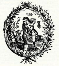
In the 16th to 18th centuries emblems sometimes took the form of allegorical illustrations or were incorporated into these illustrations. For example the illustration of a man digging, with the text "Arbeit und hoffe" (work and hope), often found in editions of the Martyrs' Mirror, are sometimes considered an emblem of the classic form of a hard working rural Mennonite. There is a rich and complex history of allegorical illustrations and their emblem-books in which many Dutch Mennonite artists and engravers contributed. These, however, are not dealt with here.
Amsterdam's canals had names but for hundreds of years its streets were not named so building were often marked with an emblem for identification. These were frequently simple shapes and forms identifying the building's function or owner’s occupation. In 1608 Mennonites (in Dutch called Doopsgezinde, i.e. Baptist minded) built a church in Amsterdam and they marked their building with a simple emblem drawing of a lamb. This church became known as the Lamist Mennonite Church. In 1664 the Amsterdam congregation split and the dissenters moved out, worshiping in the Zon meeting hall. This became the Zonists' congregation. "Zon" is Dutch for sun and their building was marked with a sun emblem. In 1801 the two congregations reunited and now they identify themselves with an emblem that combines both their sun and lamb forms.
From the mid 19th century on with the expansion of lithographic printing, innovations in visual arts, graphic design and the Arts and Crafts movement in western societies began the creation of simple line, shape and colour emblems which often incorporated text for a visual identity system. By the middle of the 20th century most major Mennonite congregations and organizations had designed some form of identity emblem.
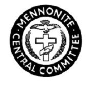
People can have strong attachments to some emblems and can associate them with important events, personal experiences or organization's functions. Over time organizations also modernised and reworked their emblem to make a more contemporary attachment to members or clients of that organization. An example of change is seen in the Mennonite Central Committee's (MCC) emblem. In the 1940s Arthur Sprunger designed the original circular MCC emblem. The organization name is in English and surrounds a winged dove and two heads of wheat with a cross and a pair of clasping hands in the middle. This is an emblem of what MCC stands for: Christianity, friendship, peace and food relief. In 1970 at the 50th anniversary of MCC, a simpler and slightly abstract structured emblem designed by Kenneth Hiebert replaced the original emblem. This new emblem joins the cross and dove and is more universal with the absence of text. However, it lacks the wheat and hands, signs that are integral functions of MCC.
Careful planning, thought and consultation are expended by most Mennonite organizations and churches for the development of their emblems. This involves choices of colour, shape, structure and signs and the meanings these impart for interpretation and recognition by members and outsiders. Forms from scripture like the cross, the dove, flowers or vegetation, praying hands, biblical quotation, or an open book are marks of Christianity and used in many Mennonite emblems. As art forms and fashion change over time, so the composition of emblems sometimes change to keep them being relevant. Change of emblems however, occurs slowly often only as generations change.
Emblems in the form of "Hex signs" are often associated with Pennsylvania Dutch culture but rarely, and perhaps never, are they seen on Amish or Mennonite farms or household buildings likely because the word "Hex" is from the German "Hexe" meaning Witch and is thus associated with non-Christian beliefs and practices.
Added Note: The English language has a rich nomenclature for emblems and symbols, and there are sophisticated legal system to control them. Thus an emblem or symbol can also be identified as: badge, brand, coat of arms, copyright, crest, icon, ideogram, insignia, logo, monogram, motif, sign, slogan, token, trademark, or wordmark. Though these are sometimes used as synonyms they usually differ in usage, or in detail, or connotation.
Bibliography
Dreyfuss, Henry. Symbol sourcebook: An authoritative guide to international graphic symbols. New York. McGraw-Hill 1972.
Isaak, Helmut. Menno Simons and the New Jerusalem. Kitchener, Ontario, Pandora Press. 2006. see: pp.32-34 (On Thau or Tau)
Liungman, Carl G. Dictionary of Symbols. Santa Barbara, California. ABC-Clio, 1991.
"MCC Visual Identity." Intersections: MCC theory and practice quarterly. 22 October 2018.
Original Mennonite Encyclopedia Article
By John C. Wenger. Copied by permission of Herald Press, Harrisonburg, Virginia, from Mennonite Encyclopedia, Vol. 2, p. 194. All rights reserved.
An emblem is a device, sign, or article associated with a person or truth; in Catholic piety, e.g., a carpenter’s square is associated with Joseph; an eagle with the evangelist John and with Augustine. In Mennonitism the term has most frequently been used in connection with the bread and cup of the Lord’s Supper, the expression most commonly being the “sacred emblems.” In the Anabaptist-Mennonite tradition the bread and wine are symbols only, the doctrines of transubstantiation and consubstantiation being alike rejected.
In modern times the Mennonite Central Committee emblem has become familiar in Mennonite circles and in relief work—a circle within which is a cross with two clasped hands superimposed over it, along each side heads of grain, and over the cross a dove, together with the words, “In the Name of Christ.” This symbol of peace, love, and service represents the concern to minister to mankind in the name of Christ and in response to His love which moves His children and disciples.
In the Netherlands youth groups like Menniste Bouwers have emblems; on the Dutch hymn-book of 1945, appear the symbols of Lamb and Sun (emblems of the former separated groups of Lamists and Zonists). The Mennonite congregation of Aardenburg has a seal which shows a lamb.
| Author(s) | Victor G Wiebe |
|---|---|
| Date Published | February 2021 |
Cite This Article
MLA style
Wiebe, Victor G. "Emblems." Global Anabaptist Mennonite Encyclopedia Online. February 2021. Web. 19 Apr 2024. https://gameo.org/index.php?title=Emblems&oldid=169901.
APA style
Wiebe, Victor G. (February 2021). Emblems. Global Anabaptist Mennonite Encyclopedia Online. Retrieved 19 April 2024, from https://gameo.org/index.php?title=Emblems&oldid=169901.
©1996-2024 by the Global Anabaptist Mennonite Encyclopedia Online. All rights reserved.


